I needed this for work today.
Here's simple recbar function for manually adding recession bars to an existing plot:
recbar = function(
start,
end,
ymin = par('usr')[3],
ymax = par('usr')[4],
col = "hotpink",
alpha = 0.3,
border = NA
) {
rect(start, ymin, end, ymax, col = adjustcolor(col, alpha), border = border)
}
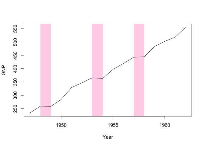
library(tinyplot)
plt(
GNP ~ Year,
data = longley,
type = "l",
draw = recbar(c(1948, 1953, 1957), c(1949, 1954, 1958))
)
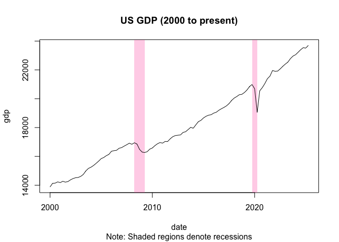
For a more sophisticated version, we could combine this simple recbar function with a sister function that actually calculates the recession dates (e.g, based on some window logic like two consecutive quarters of negative growth). Proof of concept:
recessions = function(gdp, dates, window = 2) {
  streaks = rle(c(NA, 0 > diff(gdp)))
  rec_flag = streaks$lengths>=window & streaks$values==TRUE
  end = cumsum(streaks$lengths)
  start = end - streaks$lengths #+ 1
  start = dates[start[rec_flag]]
  end = dates[end[rec_flag]]
  return(data.frame(start = start, end = end))
}

gdp = read.csv("https://fred.stlouisfed.org/graph/fredgraph.csv?id=GDPC1&cosd=2000-01-01") |>
  setNames(c("date", "gdp"))
gdp$date = as.Date(gdp$date)
rec_dates = recessions(gdp$gdp, gdp$date)

plt(
    gdp ~ date,
    data = gdp,
    type = "l",
    draw = recbar(rec_dates$start, rec_dates$end),
    main = "US GDP (2000 to present)",
    sub = "Note: Shaded regions denote recessions"
)
It shouldn't be too tricky to roll these into a dedicated type_recbar() tinyplot type if that sounds useful?
I needed this for work today.
Here's simple
recbarfunction for manually adding recession bars to an existing plot:For a more sophisticated version, we could combine this simple
recbarfunction with a sister function that actually calculates the recession dates (e.g, based on some window logic like two consecutive quarters of negative growth). Proof of concept:It shouldn't be too tricky to roll these into a dedicated
type_recbar()tinyplot type if that sounds useful?